
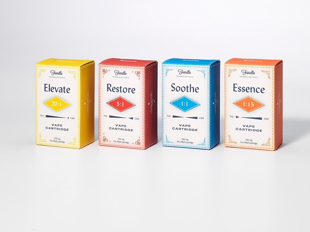
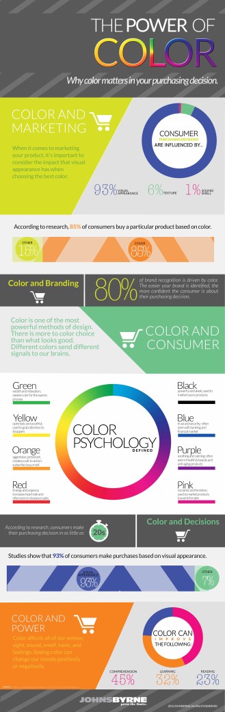
At JohnsByrne, we understand that when it comes to the communication function of packaging, color is one of the most significant components for attracting customers. Visible from a greater distance than other elements, such as copy, shape and graphics, color is vital to packaging. The greatest reason for this is that the psychology of color is highly personal and conditional. But, we can help your company make sense of this important choice. In addition, we can provide innovative printing technologies, as well as custom color options that can make virtually every color, tone and shade possible.
MAKING THE RIGHT CHOICE FOR YOUR PACKAGING COLORS
Color is evocative. It has the power to trigger feelings and thoughts—whether positive or negative. Color is also associative. One’s experiences often shape reactions to various colors. Because of this, packaging color schemes can induce emotions and attitudes about the product before the consumer knows anything about it. Ultimately, it comes down to this: in order for color to contribute to the successful match between product and target consumer, it’s necessary to know relevant details about both. In order to stand out from your competition and capture potential buyers’ attention, it is crucial to keep the following goals in mind when choosing packaging colors.

KNOW YOUR CUSTOMER
Keep the mindset of your customers at the forefront of all packaging color decisions. Whether it’s their age, gender, economic status, or education level, put yourself in their shoes to see what motivates them to buy. Don’t forget to take any cultural preferences and meanings of your target market into consideration before making your color choice.
KNOW YOUR MESSAGE
What is the end goal of using your product? What message do you want your packaging to send to your buyer? Is this message comforting, fun, conservative? Is it about health and wellness, or is it used to make the customer feel attractive or help with a problem? Is it about luxury? Is it about value? Regardless, make sure the colors send the right message. With those key considerations in mind, let’s now talk a look at packaging colors and what they mean.
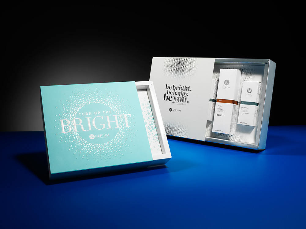
WHITE PACKAGING
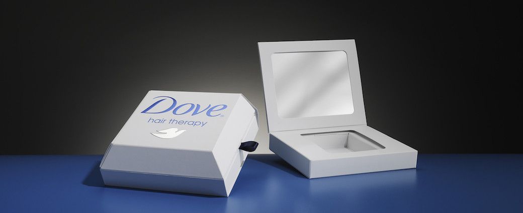
In color psychology, white is considered the blank canvas. It communicates innocence, equality and new beginnings. As a packaging color, white is safe, simple, unadventurous and conservative, but a good choice where you want to create a look that signifies cleanliness, purity, efficiency or simplicity.
BLACK PACKAGING
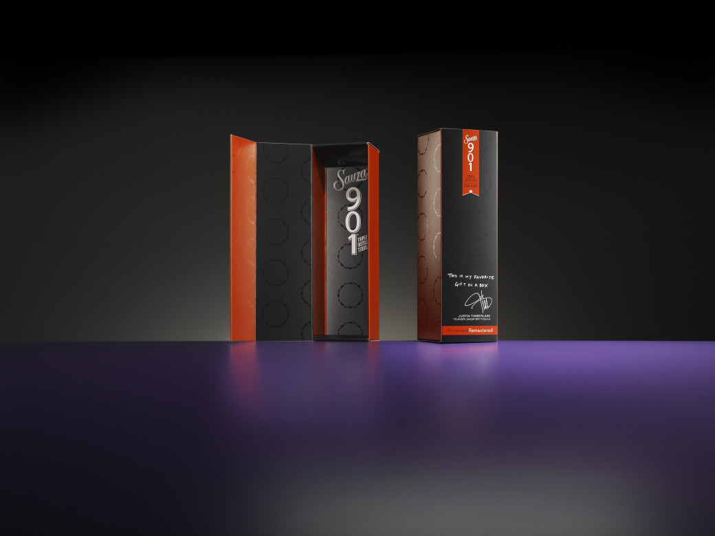
Black is a powerful color, signifying control and authority. When used as a packaging color, black tends to stand out and make products appear heavier, higher end and communicate an enhanced perceived value. It evokes mystery, class and elegance.
As with white or gray, you can add a secondary color to black packaging to change the connotation. Adding gold or silver foil stamping creates elegance and sophistication to attract a wealthier market. Adding red creates an adult or sensual connotation, (however people of Spanish descent appreciate how the combination reflects their heritage, as with the popular soap brand, Maja). Combining rose or pink softens the message and attracts the female market, while fuchsia or magenta makes it more unusual and attractive to more creative customers. As a rule, the brighter the hues, the less serious the message becomes.
BLUE PACKAGING
One thing to consider with blue is that universally, it is the most liked color by both males and females. This makes it the “safest” color to use, but that choice may backfire and result in a boring, predictable package. The key is to choose the right blue packaging that relates to your specific market and add decorative textures and finishes to make your product stand out. Darker blue is more suited to an older market, while bright, electric blues appeal to a younger market.
Color psychology links blue to honesty and dependability, strength and harmony. When used in your packaging colors, it corresponds to the product’s effectiveness and reliability. The darker the blue packaging, the more professional, serious and conservative the product will be perceived to be. The lighter the blue packaging, the softer and more creative the product will be perceived to be. Blue packaging can also indicate a product that will contribute to the buyer’s relaxation and serenity.
RED PACKAGING
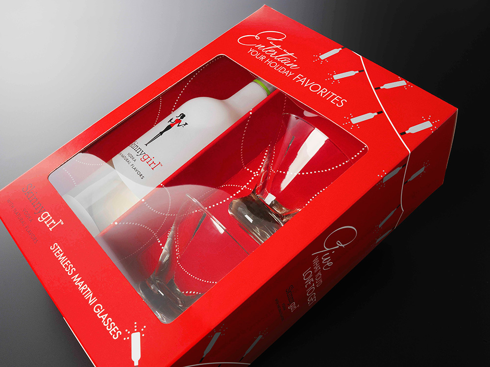
Using red draws attention to your product, stimulates the senses and excites the potential purchaser because red signifies liveliness, action, passion, enthusiasm and strength. Dark reds are perceived as professional and luxurious, while bright reds are more exciting and energetic and generally of lower perceived value than dark reds. Adding gold or silver for the printing or decoration of your red packaging increases the perceived value.
GREEN PACKAGING
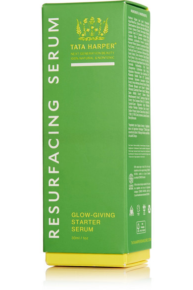
A color associated with balance and harmony, green is linked to security, wealth and growth. Always a great choice for nutraceuticals, eco-friendly or natural products, green suggests natural, organic and healthy items. Dark green implies wealth, luxury and professional quality, while light or muted greens suggest environmentally safe and nutritious. Green packaging is often an ideal color to choose, with the addition of decorative finishes or printing in colors that will attract your target market, it will prove even more effective.
ORANGE PACKAGING
Orange packaging suggests cost effectiveness, fun and adventure. There is almost a gamble involved in buying a product in orange packaging. It suggests something different, a journey, or an affordable price. In color psychology, orange means exploration, optimism, self-confidence and friendliness. It is passionate, extroverted and outgoing. While some variants of orange can give the impression of cheapness, enhancing the orange package with another color can alter the message and increase the perceived value.
YELLOW PACKAGING
Cheery, positive and uplifting to the spirits, yellow is evocative of original ideas and creativity. Mentally stimulating, it has also been known to aid in decision-making, which makes it a good choice for saturated markets. In packaging colors, yellow suggests either something original and innovative or a cheap, fun product. With its positive and happy energy it attracts children and young adolescents. Yellow packaging would be a great fit for products that aim to lift the spirits or bring joy.
TURQUOISE PACKAGING
Reminiscent of the sea, turquoise signifies clarity of thought and communication. Calming to the emotions and restorative to the spirit, it can renew energy and inspire positive thought. Turquoise is a good color for health facilities and practitioners. Using turquoise packaging for cleaning products is also ideal because it reflects purity without feeling too sterile or clinical.
PURPLE PACKAGING
Using purple in your packaging colors suggests luxury, indulgence, exceptional quality or exclusivity, particularly if used with gold or silver printing or decoration. Purple relates to high ideals, imagination, spirituality and uniqueness. Packaging of holistic products and anything to do with spirituality does well with this color. Purple packaging attracts the female and youth market more so than males, although it is slowly becoming more accepted.
PINK PACKAGING
Pink packaging is calming and non-threatening. It is generally most appropriate for products relating to the female market such as cosmetics, fashion, beauty and romance because pink is inspirational, sincere, empathetic and soothing. Pink is feminine and youthful in its softer shades, with more passion and energy in its deeper shades. Combining pink with darker colors gives it more sophistication and strength. Dusty or subdued pink packaging attracts a more sentimental and older market. Using bright or neon pink tends to imply a less expensive and trendy product, which is eye-catching to teens and preteens.
SELECTING YOUR PRODUCT PACKAGING COLORS WITH HELP FROM EXPERTS
While color is certainly an important factor in total product design, at JohnsByrne, we believe compelling packaging stimulates the consumer’s five senses. We help our clients capitalize on this by creating customized printing and color packaging solutions that “press the limits.” For more information or assistance, contact us today.
Related Posts
As e-commerce continues to expand and the retail environment—in terms of brand display—grows ever more sophisticated, it’s essential for brands to stay on trend with … Premium Packaging Solutions: Following Trends with Real Brand Impact
Ever since the first cave paintings and sharing of tales around the campfire, we humans have been obsessed with sharing experiences as vividly as possible. … Where Customer Experience Meets Social Media Buzz: Leveraging Unboxing Videos for Your Brand
Effective packaging is memorable to the consumer and sticks out amongst competitors. While bold colors and structures can help set your brand apart, creating a … How to Elevate Your Brand with Sensory Packaging