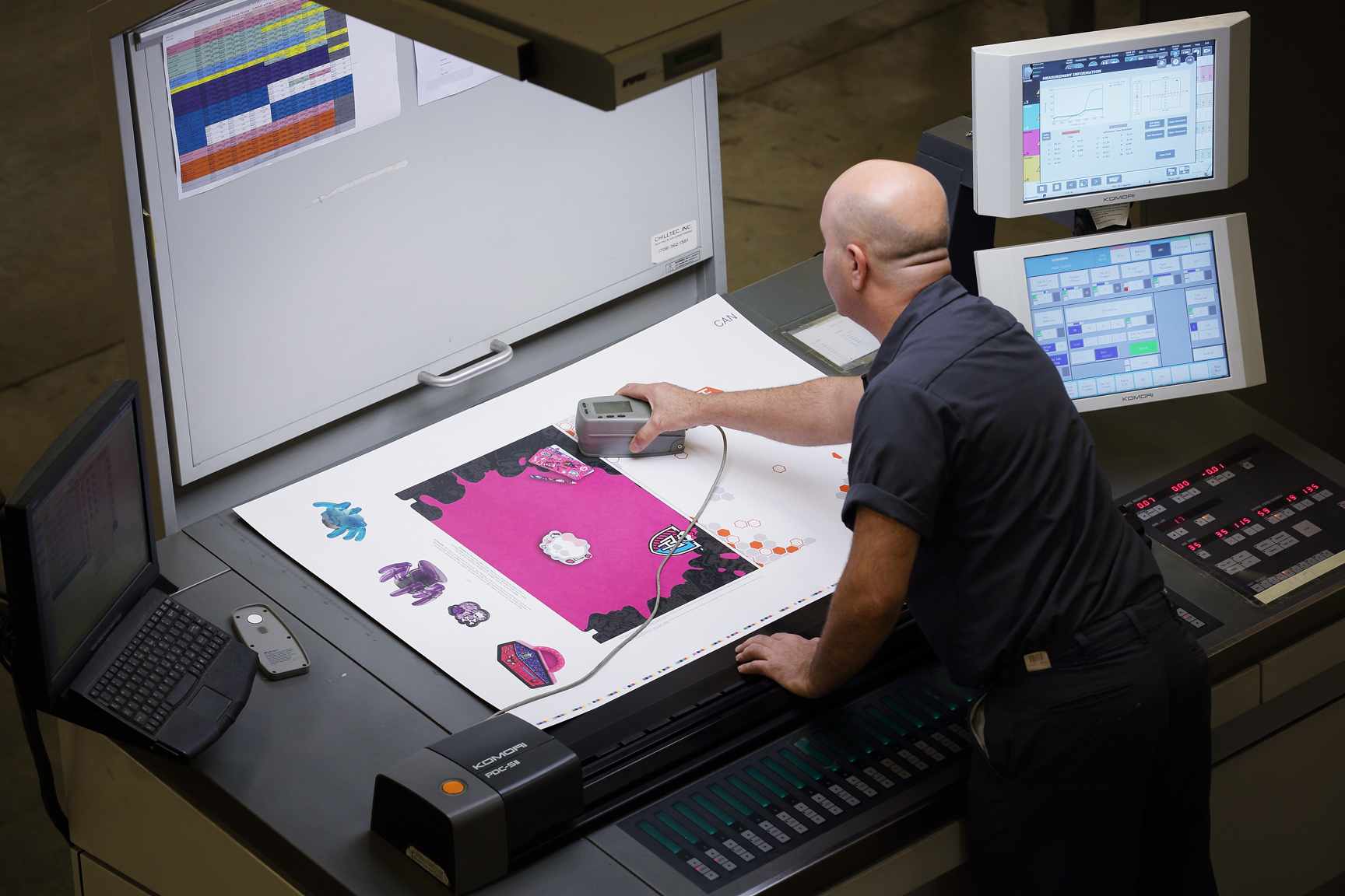
Have you ever wondered how printing suppliers achieve consistency across print runs and across multiple presses? Everyone sees color slightly differently, and certain hues may appear differently depending on the type of substrate used in printing or even the press on which a job is printed on. So how can brand managers ensure their print or packaging project looks consist and 100% on brand?
If you’ve ever wondered how to color integrity is achieved and managed, here are five fast facts about color management you should know:
What You See Isn’t What You Get

Why is color management in printing necessary? Computer monitors and printing presses render color differently. A designer may spend hours working on an exact shade of blue only to find it printed as something completely different.
This happens because monitors use the RGB color model, which is an additive method where red, green, and blue are combined to form different colors. By contrast, printing presses use the CMYK color method, which utilizes layers of three colors of transparent ink – cyan, magenta, and yellow—and black to form different shades. Unlike the RGB model, CMYK is subtractive, meaning these bases are removed to form a particular color. In addition, impurities in CMYK inks may cause variations in colors.
Hue and Saturation

Beyond color mixing, there is more to managing the exact shade in the printing process. Hue refers to the dominant wavelength in a color. Different wavelengths make up a single color, but people will perceive one to be the strongest. For example, you may see an object as purple, but it contains wavelengths from other parts of the spectrum.
Saturation is the degree of a color’s purity. A highly saturated color contains a narrower range of wavelengths. Hue and saturation both need to be considered in color management techniques because they can create variations.

Pixels and Print Size
Digital images are made up of pixels, which are units of information. The more pixels, the more detailed the image. Each pixel is made up of a series of numbers that describes its color and intensity.
Pixels only apply to digital images –they are useless for describing actual prints unless they include a size, such as pixels per inch (PPI). Dots per inch (DPI) is another measurement meant to describe the pixel-to-real-world conversion, but these terms are not interchangeable. Multiple dots are often needed to make a single pixel. Because of this, printers need higher DPI than PPI to depict the same amount of detail.
Device-Independent Color

Because color relies on the devices used to display it, device-independent color refers to shades that appear the same no matter the device. Essentially, device-independent color is an interpretation that neutralizes variations between devices.
Color management systems use the standard set by the Commission Internationale de l’Eclairage. CIELAB method of measuring color is based on how the human eye perceives it, making colors true to life in many instances.
G7 Training & Certifications

G7 refers to both a gray scale appearance and a calibration method for adjusting any CMYK imaging device to simulate this gray scale definition. G7 is device independent, meaning the results will always look the same, no matter the colorant, substrate, or screening technology.
The advantages of working with G7-certified printing companies is that you can seamlessly replicate any color you need across calibrated presses and even from one print shop to another. JohnsByrne, a G7-certified printing company, offers an innovative ink lab to meet even the most difficult color matching challenges.
Stay tuned for another fast five facts!
Related Posts
When it comes to creating standout packaging, the folding and gluing process is the unsung hero that transforms flat, printed materials into eye-catching, functional packages. … Fast 5 Facts: Folding and Gluing: Bringing Packaging to Life!
In today’s competitive market, packaging does more than just protect a product; it tells a story, engages the senses, and leaves a lasting impression on … 20 Premium Packaging Finishes: A Guide to Elevating Your Brand Experience
This is simple: it’s not just a box. Every product deserves packaging that is both practical and exceptionally appealing. It should be structurally conceived so … Custom Product Packaging Solutions for Brand Loyalty and Preference
