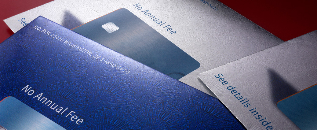
Some direct mailers are designed as postcards, with the content displayed directly on the piece, but many still use envelopes, particularly when more information needs to be conveyed than can fit on a postcard, or when the mailer has multiple elements. If you choose to use an envelope, it is important to keep in mind that the envelope is the first thing a consumer will see, and can present an extra barrier to your mailer’s content, so care should be taken to make sure that the envelope is attractive and engaging, and encourages recipients to open it.
Don’t Be Lost at Sea-The Sea of Same!

Depending on the purpose of a mailer, it may make sense to use a run of the mill white envelope with your message and offer. However, most of the time these envelopes get lost in the ‘sea of same’ as the consumer collects their daily mail. This is why it is important to develop and invest in an outer envelope that will stand out from the mail stack: simply being noticed is the first goal of any mailer. Use of color, texture, dimension or interactivity will deliver your message/offer with more potency and get the consumer to open yours.
Text and Pictures
Studies show that the first place a person looks on a piece of mail is to their own name and address: they want to see that it is intended specifically for them, and that the name is spelled correctly. Here, typography is important: what tone do you want to set – businesslike or friendly? Is the font you chose easily readable and large enough? Envelopes are traditionally devoid of pictures, but they don’t have to be – a well-placed picture on the envelope can catch a consumer’s eye and increase the likelihood that the mailer stays out of the trash.
Many mailer envelopes include a teaser line, which hints at what’s inside, in the hopes of tantalizing the consumer into opening it. Teaser lines alluding to offers that are “time-limited” or “exclusive” are often effective in inspiring the consumer to open the envelope.
Interactive Elements

With direct mail, the key is quick and sustained engagement. A zip-strip opener, peel-off sticker, or another interactive element that is incorporated directly into the structure of the envelope encourages consumer engagement. The longer the individual spends looking at, fiddling with, and exploring the envelope, the more likely they are to actually open it and peruse the content. A peel-off sticker or other removable element also gives the feeling that the recipient has already received a gift or won a prize, enticing further exploration.
Direct Mail That Works
At JohnsByrne, our creative team is dedicated to constantly innovating new solutions for our clients. We specialize in highly customized print jobs, and are at the forefront of market trends and new developments. If you’re interested in collaborating with our exceptional team and taking advantage of the processes we offer in our state-of-the-art facility to develop a direct mail campaign that gets results, get in touch with us today.

Related Posts
The direct mail industry may have been around for a while, but innovation is no stranger to the industry. From using various stocks and structures … Innovations in Direct Mail that are Changing the Playing Field for Marketers
In the financial industry, relationships are key and welcome kits are a unique way to build lifelong loyal customers. When done correctly, an engaging welcome … Launching a Credit Card Welcome Kit: Do’s and Don’ts
Photo Credits: Culligan Welcome kits are not only a great promotional tool for brands, but they are also a great way to create and improve … 7 Custom Welcome Kits Your Brand Can Use
